The Art of Colour Mixing

With all these new ideas and techniques brewing away, I always like to make sure that one of the fundamental things I teach my stockists and one that is truly at the heart of my business never changes. Since I began training my stockists I have always focused on colour mixing with Chalk Paint®. I want all of my stockists around the world to be confident colour experts and understand basic colour theory. I want them to be the first stop for their customers when they decide on what colour or combination is right for them, what colours work together, what makes colours warmer or cooler, what specific tones work, how to darken colours, how to create new shades, you get the picture!
You may not know that I come from an art school background, which is where my love of colour theory really blossomed. I loved learning about where specific colours came from and how they were used throughout history, how they worked or clashed together and how to really use them in the best possible way. As a poor student, I had to make sure that I made the colours of paint that I bought really stretch and last me a long time, so out necessity, I became infatuated with mixing.
Most of us have done some basic colour mixing when we were children, usually with those bold, bright primary colours of red, yellow and blue, also known as cadmium red, cadmium yellow and ultramarine. From these three colours , you can, in theory, mix any colour you can think of. However, if you’ve ever done some colour mixing you might know it’s not as easy as that! Images of a sludgy brown when I wanted something like a gorgeous earthy yellow or a deep, rich purple spring to mind.
So when I was creating my colours, I wanted a tool that became a springboard for you to launch into an exciting world of colours that you might not have even thought you could create yourself. I wanted to make sure that my colour palette was accessible and easy to understand and that it should be a tool in your arsenal, just as important as your favourite paint brush.

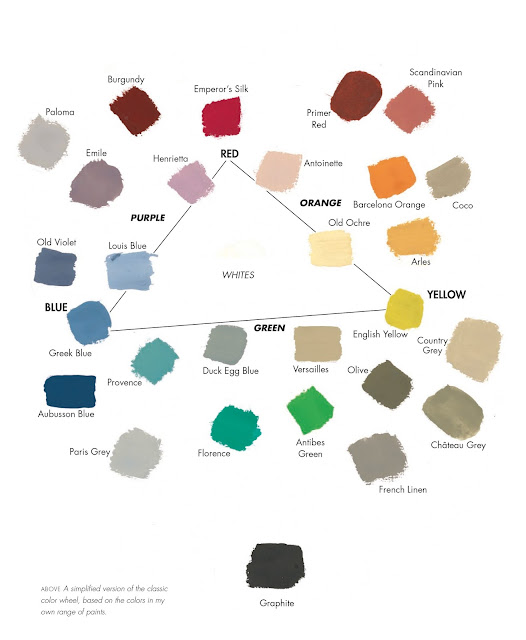
I say colour wheel, but it’s actually more of a triangle. This is because it is a simplified version of the classic colour wheel, with the thee points being shades that you cannot create by mixing, those primary colours, which in my world are called Emperor’s Silk, English Yellow and Napoleonic Blue. From these three, the colours expand to make oranges, greens and purples, such as Arles, Florence and Emile. What makes my paint unique is that not only do I encourage you to mix my colours together, but I’ve made it as easy as I can, too. There is very little black pigment in my paint, so when you mix any of my colours together you are far less likely to end up with that sludgy, dull brown of the past.

Talking of black, if you wanted to darken a colour the best way is to not add black (i.e. Graphite) but to find it’s complementary colour. To do this simply find the colour on the opposite side of the wheel and add a little to your colour. So, if I wanted to darken Emperor’s Silk, I would add a little Olive or Florence to reach a beautiful, rich red. To bring depth and interest to a piece of furniture this technique looks great when you pair it with the same base colour you started with. For example, I would paint a chest of drawers Emperor's Silk and then use my darkened, mixed red to any detailing or even just the corners of the drawers, to really make the piece interesting.

If you have never tried mixing any of my Chalk Paint® colours together, the best tip I can give you is to study my colour palette and then start with a colour you feel comfortable with, even if that is just adding a little Old White to a colour to lighten it up. You never know, you could become a colour expert in your own right, mixing everything from minty greens, bright fuchsias and even chestnut browns (try Antibes Green and Burgundy). Adding a little Old White to your mixed colour really reveals it's undertones too.
And now, my new mixing sticks are perfect for sharing these gorgeous colours you’ve created with me, just snap a picture (or two or three!) and don’t forget to use either #anniesloan or better yet #MixitMonday, the dedicated day for colour mixing with Chalk Paint®. This week, Ive been doing just that with colours that people have mixed that inspire me, have a look at some recent colours I’ve been creating over on my Facebook and Instagram.
You can read the original article here: The Art of Colour Mixing
